Post by Star on Jan 6, 2012 12:58:56 GMT -5
Okay, so I am going to start this tutorial with the actual image. This is a pretty simple looking one that shouldn’t be too complicated. I’m sorry this is so image heavy. I didn’t think to resize them. If anyone needs anything explained, just let me know. Now I sometimes choose my color scheme before I begin (sometimes). So with this one I wanted mostly monochrome colors and one “stand out” color. So I went with black, white, gray, and pink.
1. Since this is for a layout, we need a pretty big canvas. I went with 1366 x 769. So open a new file of this size.
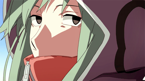
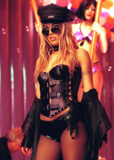
2. Next, chose your main image and paste it into the document. I’m using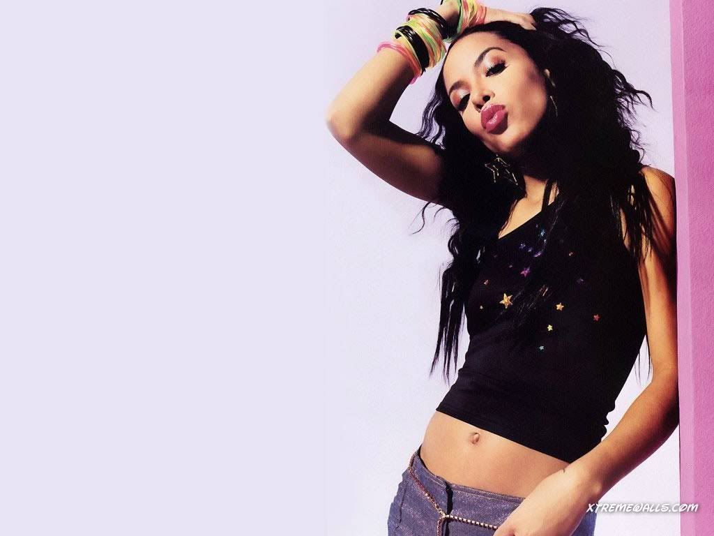 .
.
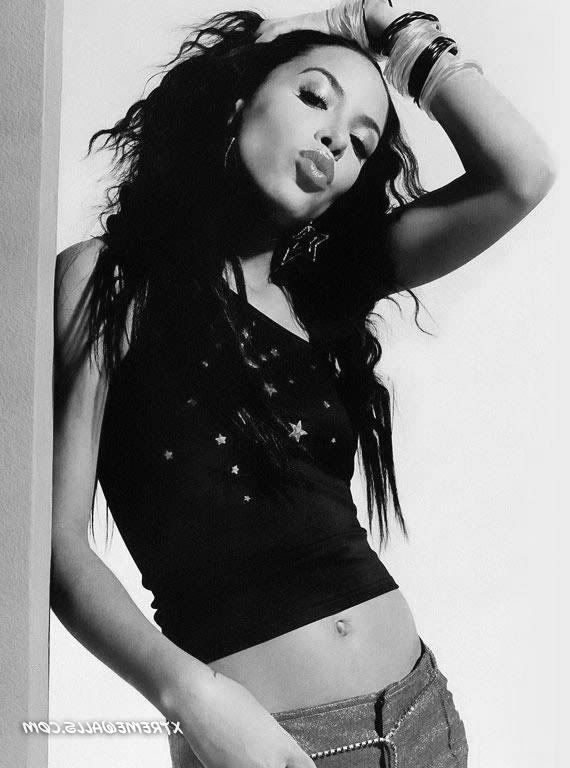
3. Go up to Image > Adjustments > Desaturate to take the color away from the image.
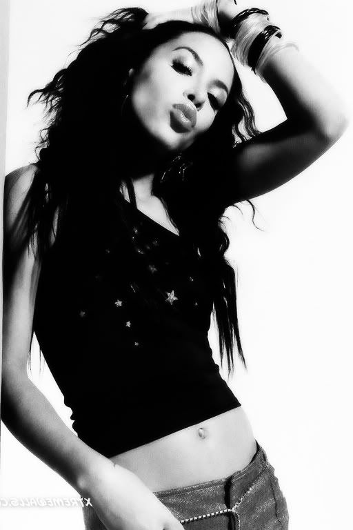
4. Now, I want my picture on the other side. So go to Edit > Transform > Flip Horizontal.
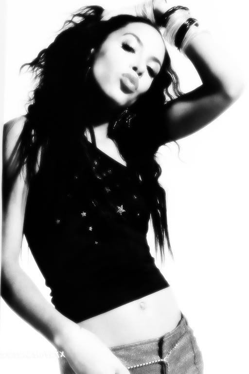
5. I’d like to smooth my image out and make it more bold so right click on the image layer and go to “Duplicate layer. Next, go to Filter > Blur > Gaussian blur. Here, we want less defined details so set the radius to about 3.0 and click OK. Once that is done, head to that drop down menu beneath the Layer tab and set the layer to “Overlay”. The image will go from
to
 .
.
6. I wanna brighten this up even more so duplicate your overlay layer, set it to “Screen” and put it BELOW your overlay layer. You should have something like this now:
7. Now for my pop of color. Create a new layer (you may wanna label these to keep up with them). Grab your brush tool, preferably with one of those “fuzzy circles”. I’m using the color fe0089 for the foreground color on the color picker. With this, color over her lips, white bracelets, shirt stars, and pants.
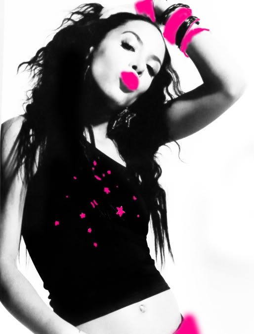
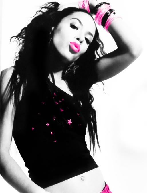
8. It looks pretty shitty at this point. So go to your drop down menu once again and set the layer to “Overlay” to get something like this:
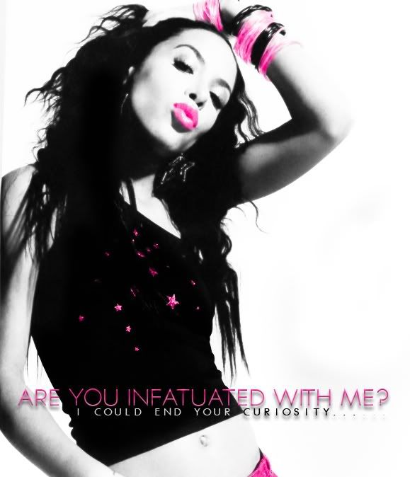
9. It’s starting to look like something so now we should add some text. I chose song lyrics from some old entrance music. You go to your text tool and write…whatever you like. I’m using a font called Typograph Pro that can be really hard to find for free. I know a lot of people seem to have trouble with making text look good. It’s really just a matter of experimenting. Here, I went to my blending option (that “fx” button) and added a Drop Shadow. I also added a bevel (which is something I do very rarely because it can be tacky). I also added a foreground to background gradient set at opacity of 41%.
10. Next, I added another line of text using the font Futurist-fixed Width set at a smaller size. This text is being placed in an awkward spot because her shirt is black and the background is white. To sidestep this, I just make the font color over her black shirt WHITE and the font color on the white background BLACK. Next, I add a drop shadow to this. So far we should be at…
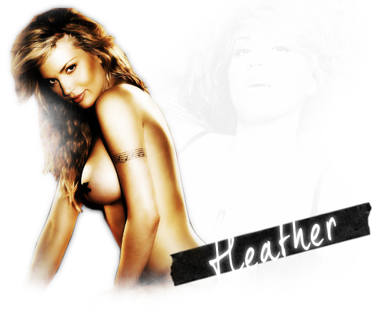
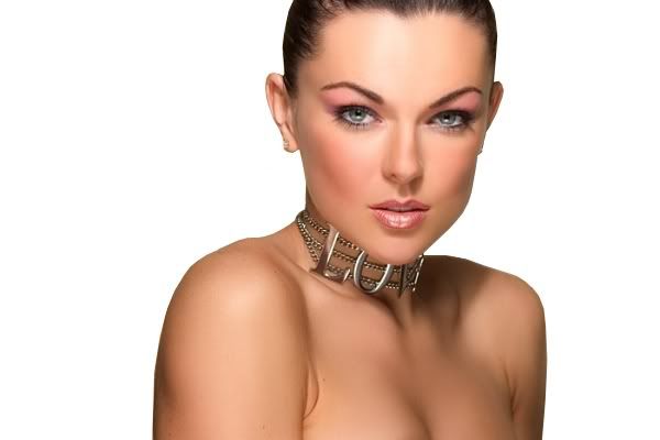
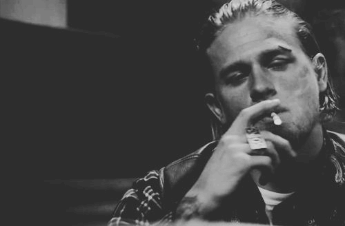
11. For some reason that white space next to her is bothering me so I wanna fill it with something. I’m a big fan of polaroids so I’m going to make some of those using these pictures
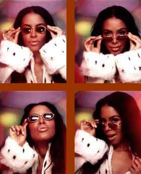
and this frame
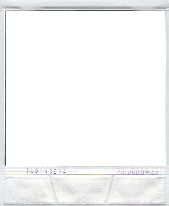 . Using the rectangular marquee tool, cut the center of the Polaroid out.
12. Now, for the pictures themselves, we have to break them apart. So separate them into 4 separate pieces.
13. I went these to fit well with the layout so, using the same pink color used earlier, go up to Image > Adjustments > Hue/Saturation. Next, check the “Colorize” box, which will put your image into shades of your foreground color, and increase the saturation to your liking.
14. Just as we did with the earlier images, I’m going to smooth this out by duplicating the layer, going to Gaussian blur at a 3.0 radius, and setting this layer to “Screen”. Once you do that, while your “screen” layer is selected, press Control + E to combine the two layers. Do this with each one of the images.
15. Looking at the images and thinking of how you want them to look on your layout, you should be able to get them to a decide size by going to Edit > Transform > Scale. Use the little boxes to adjust the size of the images and the Polaroid frame, which you while lay on top of the pictures. Press CTRL + E to combine the picture and the frame for each image. When this is done, paste your polaroids in your layout image to your liking.
16. I feel like the white background needs slight sprucing up, so I’m gonna take this brush, called “Define” from at0mica.net and brush it around a little bit. Make sure to clean up any pieces that may have gotten on the images with the eraser tool.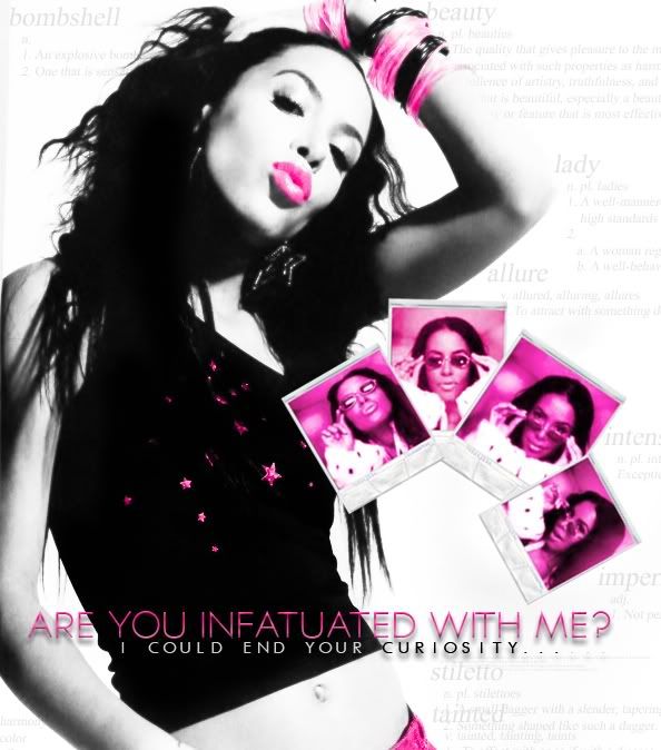
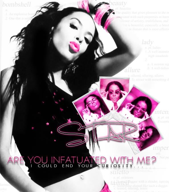
17. I think I need her actual name on here somewhere soooo I go ahead and write it using my text tool with a font called “Luna Bar” in BLACK. Once again, I go into my blending options and add a drop shadow. I also add an outer glow using my pink color and bring the size up to 7. Lastly, I stroke it (hehe) with the size of 1px and the color of white. Press okay and then set this layer to “Subtract” (or any other one you think looks nice) and lessen to FILL (which is under opacity) to 42%. So this side, I would say, is complete. We don’t wanna junk it up too much.
18. Moving to that big blank white space with still have, create a new layer and grab the rectangle tool. With this, make a large, black rectangle from top to bottom. The size of it depends on how much surface you think you need in order to write. Once that is done, go back to your blending options. Add a drop shadow using our earlier pink color with these settings
Distance: 1px
Spread: 15%
Size: 27 px
Lastly, add a 3px, white stroke.
19. For the post part, the image is complete. I’m not too font of the remaining white space on the other side of my black text area though so I’ll simply grab this lovely collage I found browse.deviantart.com/?qh=§ion=&q=collage#/d8rzdg and paste it underneath the rectangle. Next, I go to Hue/Saturation to color the collage with my pink color and bring the opacity down to about 13%. Save this as a .jpeg or .png file.
Here is the end result:
stardeveraux.webs.com/bio.png
I’ll be doing the coding to make this into an actual layout next.
1. Since this is for a layout, we need a pretty big canvas. I went with 1366 x 769. So open a new file of this size.
2. Next, chose your main image and paste it into the document. I’m using
.3. Go up to Image > Adjustments > Desaturate to take the color away from the image.
4. Now, I want my picture on the other side. So go to Edit > Transform > Flip Horizontal.
5. I’d like to smooth my image out and make it more bold so right click on the image layer and go to “Duplicate layer. Next, go to Filter > Blur > Gaussian blur. Here, we want less defined details so set the radius to about 3.0 and click OK. Once that is done, head to that drop down menu beneath the Layer tab and set the layer to “Overlay”. The image will go from
to
.6. I wanna brighten this up even more so duplicate your overlay layer, set it to “Screen” and put it BELOW your overlay layer. You should have something like this now:
7. Now for my pop of color. Create a new layer (you may wanna label these to keep up with them). Grab your brush tool, preferably with one of those “fuzzy circles”. I’m using the color fe0089 for the foreground color on the color picker. With this, color over her lips, white bracelets, shirt stars, and pants.
8. It looks pretty shitty at this point. So go to your drop down menu once again and set the layer to “Overlay” to get something like this:
9. It’s starting to look like something so now we should add some text. I chose song lyrics from some old entrance music. You go to your text tool and write…whatever you like. I’m using a font called Typograph Pro that can be really hard to find for free. I know a lot of people seem to have trouble with making text look good. It’s really just a matter of experimenting. Here, I went to my blending option (that “fx” button) and added a Drop Shadow. I also added a bevel (which is something I do very rarely because it can be tacky). I also added a foreground to background gradient set at opacity of 41%.
10. Next, I added another line of text using the font Futurist-fixed Width set at a smaller size. This text is being placed in an awkward spot because her shirt is black and the background is white. To sidestep this, I just make the font color over her black shirt WHITE and the font color on the white background BLACK. Next, I add a drop shadow to this. So far we should be at…
11. For some reason that white space next to her is bothering me so I wanna fill it with something. I’m a big fan of polaroids so I’m going to make some of those using these pictures
and this frame
. Using the rectangular marquee tool, cut the center of the Polaroid out. 12. Now, for the pictures themselves, we have to break them apart. So separate them into 4 separate pieces.
13. I went these to fit well with the layout so, using the same pink color used earlier, go up to Image > Adjustments > Hue/Saturation. Next, check the “Colorize” box, which will put your image into shades of your foreground color, and increase the saturation to your liking.
14. Just as we did with the earlier images, I’m going to smooth this out by duplicating the layer, going to Gaussian blur at a 3.0 radius, and setting this layer to “Screen”. Once you do that, while your “screen” layer is selected, press Control + E to combine the two layers. Do this with each one of the images.
15. Looking at the images and thinking of how you want them to look on your layout, you should be able to get them to a decide size by going to Edit > Transform > Scale. Use the little boxes to adjust the size of the images and the Polaroid frame, which you while lay on top of the pictures. Press CTRL + E to combine the picture and the frame for each image. When this is done, paste your polaroids in your layout image to your liking.
16. I feel like the white background needs slight sprucing up, so I’m gonna take this brush, called “Define” from at0mica.net and brush it around a little bit. Make sure to clean up any pieces that may have gotten on the images with the eraser tool.
17. I think I need her actual name on here somewhere soooo I go ahead and write it using my text tool with a font called “Luna Bar” in BLACK. Once again, I go into my blending options and add a drop shadow. I also add an outer glow using my pink color and bring the size up to 7. Lastly, I stroke it (hehe) with the size of 1px and the color of white. Press okay and then set this layer to “Subtract” (or any other one you think looks nice) and lessen to FILL (which is under opacity) to 42%. So this side, I would say, is complete. We don’t wanna junk it up too much.
18. Moving to that big blank white space with still have, create a new layer and grab the rectangle tool. With this, make a large, black rectangle from top to bottom. The size of it depends on how much surface you think you need in order to write. Once that is done, go back to your blending options. Add a drop shadow using our earlier pink color with these settings
Distance: 1px
Spread: 15%
Size: 27 px
Lastly, add a 3px, white stroke.
19. For the post part, the image is complete. I’m not too font of the remaining white space on the other side of my black text area though so I’ll simply grab this lovely collage I found browse.deviantart.com/?qh=§ion=&q=collage#/d8rzdg and paste it underneath the rectangle. Next, I go to Hue/Saturation to color the collage with my pink color and bring the opacity down to about 13%. Save this as a .jpeg or .png file.
Here is the end result:
stardeveraux.webs.com/bio.png
I’ll be doing the coding to make this into an actual layout next.