|
|
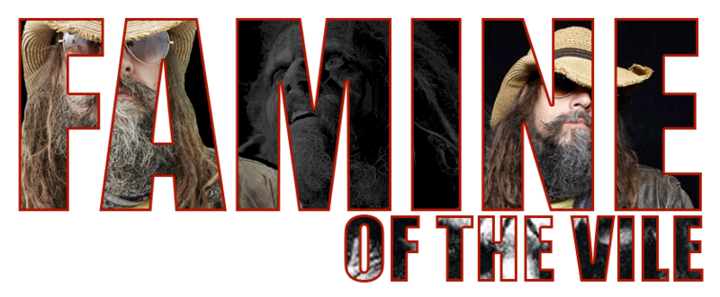
Post by Famine of the Vile on Jun 6, 2010 13:02:10 GMT -5
|
|
|
|
Post by andrewclash on Jun 7, 2010 12:34:57 GMT -5
way to go fam I actually like that banner A LOT.
|
|
|
|
Post by "Sinister" Seth Stevens on Jun 11, 2010 10:16:41 GMT -5
Fucking bad ass!!!
|
|
|
|
Post by Edward Grado on Jun 11, 2010 10:29:55 GMT -5
Appreciate that... BROTHER!!
|
|
|
|
Post by andrewclash on Jun 11, 2010 11:31:21 GMT -5
Although I wish becks didnt look so skinny irl
|
|
|
|
Post by "The Peoples GOAT" James Raven on Jun 11, 2010 23:17:29 GMT -5
Just for some friendly, constructive critiquing... the Real American one is sick, and definitely my favorite of the group. I'm not sure what it is, maybe the color balancing, maybe the second image blended with the flag as opposed to just slapped on... I'm not sure, but it's awesome. Nice work.
The C.C.P. one is my least favorite of the batch. The font on it is great, and I love the green in the background (the shade I mean), but two things kill it for me... first off is the background image, the leaf and the black design behind it kind of fight for attention. It's like one of those things where if you focus on an image you see one thing, then if you focus on a different part, you see something completely different... from one angle it looks abstract, then it looks like a dragon, then smoke... the leaf gets lost, as opposed to being a focal point. The other point is having black and white over such a vibrant green. I'm not a fan of mixing color with B&W except in very rare cases, but when you pick such an attention grabbing color, B&W just seems... blah? It's not a bad graphic, I'll just chalk it up to artistic differences.
Clash is great, I might have just added a screen over one of the Bekham pics so that the color tones were a little closer, but that's my only gripe. Same with the Nation one, I like the simplistic background, but having one image sepia toned and brown, and the other RGB color, having the black suit not match anything else kind of sticks out.
The Sentinel seems a little awkward, but I honestly can't tell you why... something about it just seems strange to me, but not in a terrible way or anything... just... off. I think it's the distortion of the secondary Khali cut. It's a cool effect, but the type of thing where if you do it, it's got to be the whole banner... slapping a normal .PSD over the top of it mixes an artistic style with a realistic style, and it doesn't work as well as it could.
Overall, good work. You're definitely improving, and again, this is just constructive criticism, my opinion, designer to designer notes, blah, blah, blah. Keep it up, Rob.
|
|
|
|
Post by Famine of the Vile on Jun 11, 2010 23:31:59 GMT -5
As always James, your critique is definitely welcome. Who better to do it than you? I appreciate the pointers and look forward to continuing to improve. It's like the old saying goes....How do you get to Carnegie Hall? PRACTICE!!
|
|
|
|
Post by "The Phoenix" Johnny O Bom on Jun 13, 2010 14:19:47 GMT -5
can you make me one with the painted face jeff hardy
|
|
|
|
Post by Famine of the Vile on Jun 13, 2010 15:40:39 GMT -5
I'll get on that this week Johnny!
|
|
|
|
Post by andrewclash on Jun 13, 2010 18:14:32 GMT -5
make more banners of everyone just in case they get tired of there old sigs.
|
|
John Stone
Rising Star
 Here Comes The Pain!
Posts: 381
|
Post by John Stone on Jun 14, 2010 20:16:16 GMT -5
That's nice work Famine. I would ask for one myself but I like the one I currently have. Maybe sometime down the road.
|
|
|
|
Post by "The Peoples GOAT" James Raven on Jun 15, 2010 10:02:10 GMT -5
I don't exactly need a new banner or anything, but it's always fun to see what other people come up with... if you have some free time after you make things for the people that need them, I'll take one.
|
|
|
|
Post by Dean James on Jun 15, 2010 13:36:08 GMT -5
Just in case you are planning on making me one i plan on changing my pic base when i return. It was going to be Raven but he's taken.
|
|
|
|
Post by The Sentinel on Jun 15, 2010 20:52:02 GMT -5
Thank's for making me a banner and i like it .... can you tell me how to put it the banner ? cos iam totally blind about it .
Thank's
|
|
|
|
Post by Famine of the Vile on Jun 16, 2010 12:57:37 GMT -5
Sentinel, right click on the banner and go to properties. Then copy the link and paste it in your profile. Be sure to add [ img ] and then [ /img ] without the spaces
James, i'll work on something for you as well this week. Should be fun.
|
|